Bitcoin Report – April 2025
Posted on 29/04/2025 | 130 Views
Today our Independent Research Analyst, Isaac Ho from the Ainslie Research Team brings you the latest monthly deep dive specifically on Bitcoin – including market analysis, on-chain metrics, sentiment, and technical analysis. He highlights some of the key charts that were discussed and analysed by our expert panel in the latest Beyond the Block episode and expands upon his work with some additional insights. We encourage you to watch the video of the original presentation if you haven’t already.
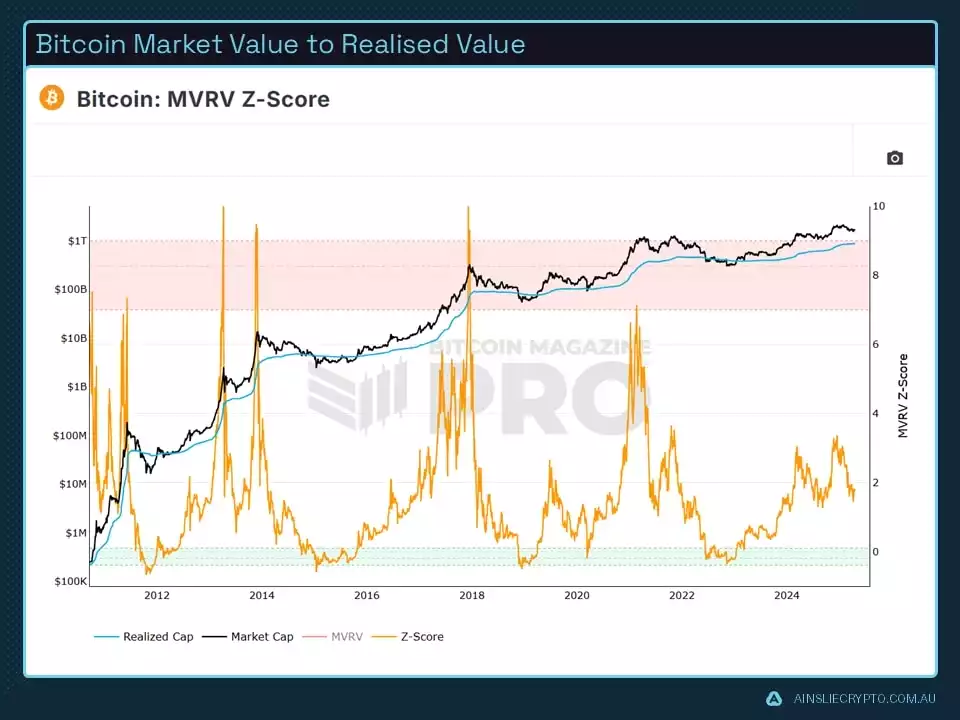
The MVRV Ratio is a crucial metric that compares Bitcoin’s market price to its realised price, offering insights into whether the market is overheated or cooling down. At present, a significant drop in the MVRV suggests declining market enthusiasm. Historically, this ratio has been a reliable tool for identifying market bottoms, though it's less effective at signalling market tops. In previous cycles, peak euphoria has often aligned with sharp spikes in the Z-Score. Whether this pattern will repeat in the current cycle remains uncertain. However, it's widely expected that market behaviour will broadly resemble past trends, albeit with more subdued peaks as the asset class matures. While no indicator guarantees accuracy, understanding these core metrics is vital for spotting major shifts in market dynamics. Rather than aiming to perfectly time tops or bottoms, traders can use these tools to navigate the broader market cycle with greater confidence.
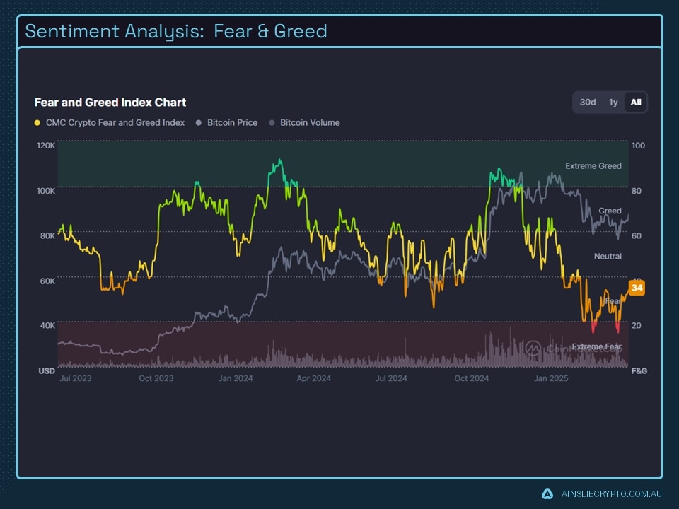
Looking at the Fear and Greed Index, sentiment has sharply declined, with the index plunging to a low of 15—one of the lowest readings in this cycle. This level of fear hasn’t been seen since the bottom of the previous bear market. Historically, such extreme fear has often preceded strong price rallies, making this index a useful contrarian signal. Still, it’s important to remember that sentiment indicators should not be relied on in isolation when making trading decisions.
Over the past seven months, the market has spent a prolonged period in the fear zone, marked by multiple false breakdowns. Now, as we approach a potential weekly cycle low, this latest surge in fear is consistent with typical market behaviour. It often signals a point where many traders believe the cycle is ending, leading to widespread selling and liquidations. Ironically, this kind of capitulation can relieve selling pressure—creating the conditions for a rebound.
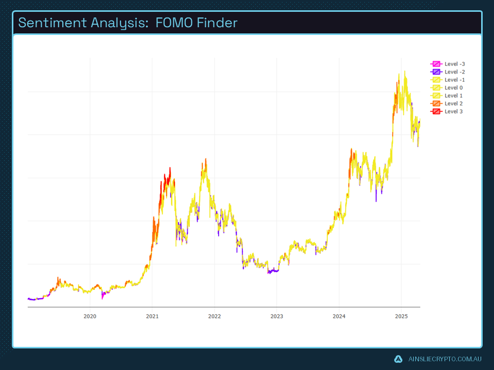
The FOMO Finder is another valuable tool in market analysis, particularly for identifying fear-driven opportunities. When the chart displays purple flashes, it typically reflects elevated fear among investors. Historically, dense clusters of these signals have reliably preceded strong upward price movements. Given this recurring pattern, it would be unwise to rule out a potential rebound at current levels.
That said, for analysts to confidently anticipate a move toward new all-time highs, the market must reclaim key structural levels. Recent price action has broken below several important thresholds, indicating that a meaningful recovery is necessary before making any decisive bullish calls.
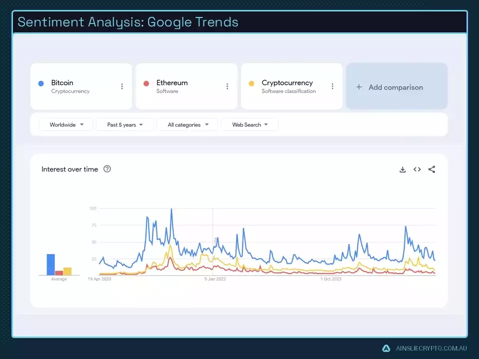
Google Trends data shows a steady level of interest in cryptocurrency, though without the dramatic spikes seen in previous cycles. This suggests that crypto has entered mainstream awareness, reducing the need for people to search basic terms during price surges. Despite the lack of sharp increases, the consistently elevated baseline indicates a deeper, more sustained engagement from participants—pointing to a maturing market.
This development is generally seen as bullish, as it reflects long-term commitment rather than short-term hype. However, it also means the explosive euphoria that defined earlier cycles may be less pronounced moving forward.
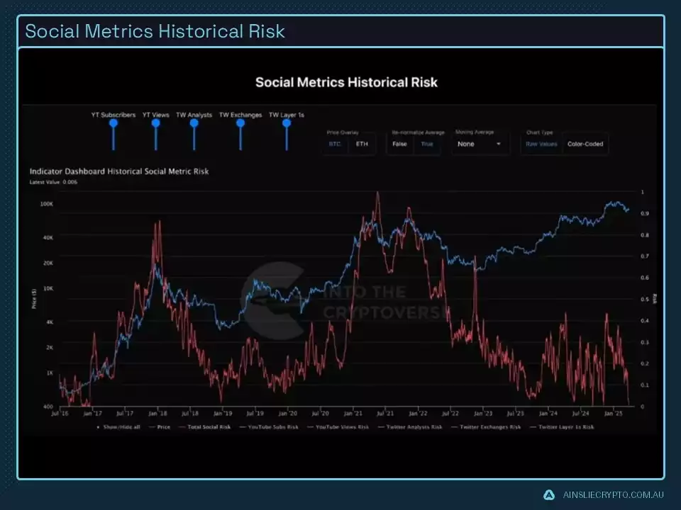
Social Metrics on YouTube and X show a complete lack of interest from the wider audience with levels seen typically in bear markets this is incredibly bullish and can be viewed as a contrarian metric considering price remains high with respect to such a metric.
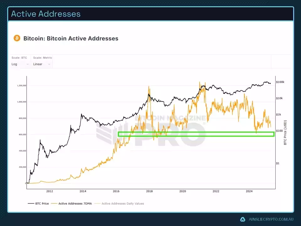
Active addresses are a key metric for gauging network activity, offering valuable insights into market dynamics. They often help pinpoint areas of supply support and resistance. Currently, the market is sitting at a support level, and historically, a rise in active addresses tends to occur in the later stages of a bull market. This uptick signals growing user participation, often reinforcing sustained momentum as activity across the network intensifies.
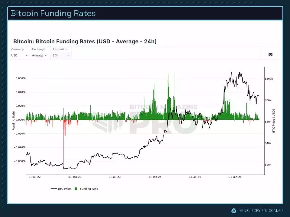
Bitcoin funding rates serve as another essential metric for gauging market sentiment. When funding rates are positive, traders with long positions pay a fee to those holding short positions. This reflects an abundance of traders betting on price increases, and to align the perpetual market with the spot price, long traders must compensate their short counterparts. This mechanism encourages traders to adopt short positions to capture the funding rate, thereby helping to balance the perpetual and spot market prices.
The value of this metric lies in its inverse: negative funding rates, which typically indicate market lows. This pattern aligns closely with the Fear and Greed Index, reinforcing a coherent framework for pinpointing optimal market entry points.
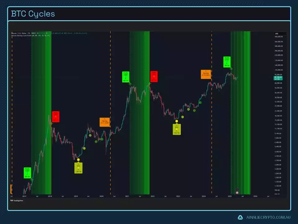
In terms of Bitcoin’s market cycles, we’re entering the broad timing window where a potential cycle top could form—calling for a cautious, measured approach. As the price moves into the lighter green zone, this indicator reflects a gradual shift from bullish momentum toward a more bearish outlook.
Importantly, the day this metric suggested it was time to start locking in profits aligned with Bitcoin reaching $110,000—followed by a decline. Moving forward, analysts will pay close attention to any further breakdowns, placing increased weight on such signals as the market progresses deeper into this zone. This heightened awareness helps refine trading strategies and maintain adaptability in a shifting landscape.
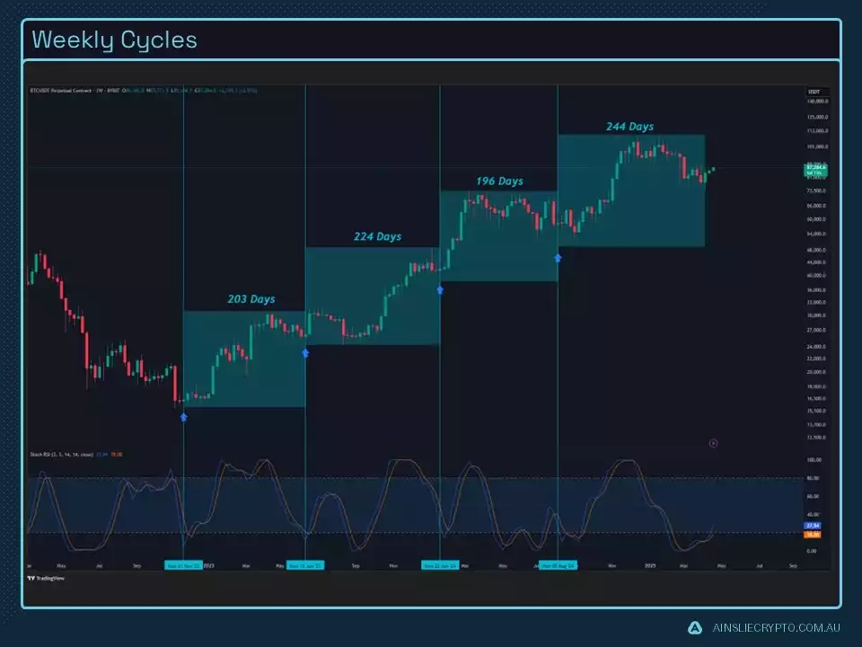
The chart clearly shows that the market is currently within the expected timing window for a weekly cycle low. However, there is still a wide range of possible days that could qualify as a valid low, given the natural variability of these cycles. If the market breaks below this potential cycle low, it would signal a critical warning, underscoring the need for heightened vigilance and a more cautious stance.
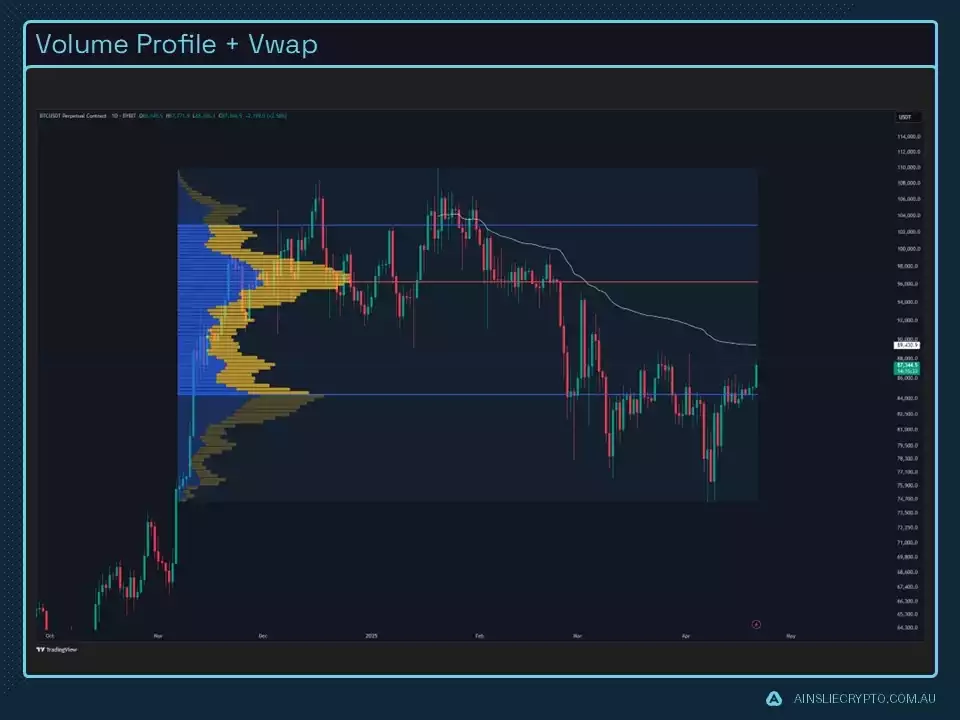
Volume data highlights significant resistance near the 96k region, this region will be important, we have already had a breakup and the local market structure has shifted so the expectation is will be clearing the level in due time, however until then it acts and remains as resistance.
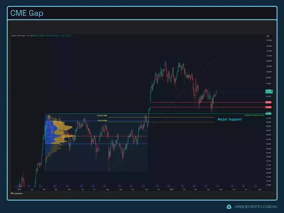
The CME gap has now been completely filled, and we have since bounced off the Market Structure key level highlighted in the video, the chances of that being the low, are very high as a lot of technical metrics were pointing to it being so.
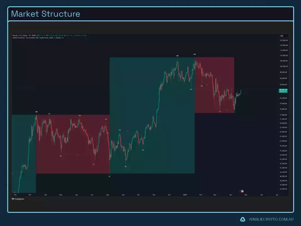
From a market structure perspective, red zones are used to highlight bearish conditions, while green zones indicate bullish momentum. At present, the market is looking to break into a green zone however that can only be confirmed once a higher low has been formed.
However, when additional indicators—such as the Fear and Greed Index and funding rates—are considered, a more bullish medium-term outlook begins to emerge. The convergence of these signals strengthens the case for potential upside, making it increasingly difficult to dismiss.
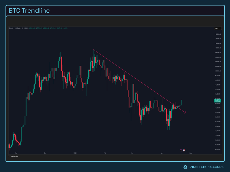
This trendline is on everyone's mind and we have since seen a clean break, this is very bullish however people expecting continuous continuation may be expecting too much out of the market as a retrace is generally what happens following a large breakout, this is called a breakout, retest and resumption.
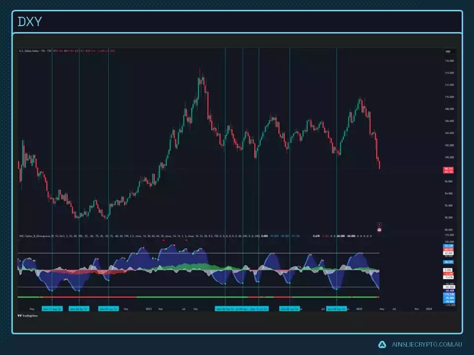
DXY has fallen off a cliff quite literally. We are in the neighbourhood for a green dot print on the market cipher, so that tells me we are in the region for a local low. As you can see, when the green print comes, we enter support for at least a little bit.
Watch the most recent video presentation of Bitcoin Analysis: Beyond the Block where we share some of these explanations in a panel format, and join the discussion on our YouTube Channel here:
We will return with a more detailed analysis of everything Bitcoin next month, including more market analysis, on-chain metrics, sentiment, and technical analysis…
Isaac Ho
Independent Research Analyst
The Ainslie Group
x.com/IsaacsDevCorner